A lot of real estate agents write them. Some have a lot of information, others… not so much. Some are well laid out and go past the numbers into interpretation. Others have plenty of numbers, but they don’t even give any sort of scale to use for reference.
I try to give mine a sense of scale, as well as interpret what the numbers mean. I also wait to post them… until the numbers are fairly solid (and even a few weeks later, the numbers might change a little bit…), but not so long as to make the report outdated as it is published. Below is an excerpt from one of my market reports:
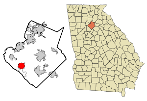
Market stats for Suwanee, GA, August, 2011 indicate that there are 593 properties on the market (down from 612 last month). Overall, there is about an 7.3 month supply of properties (down from 7.4 last month). August had 83 sales. Compared to 2010 (55), that was VERY strong. Inventory was down, as well, compared to 2010 (636). The last two months have been very strong, but that comes on a very weak June and just average sales for a couple of prior months. Obviously, I’d like to see continued strength here.
So, let’s break it down.
- 593 Properties… also showing the number of properties on the market the previous month. Is it going up or down? Which way SHOULD it be moving?
- 7.3 month supply… This is the Absorption Rate. Here is a whole post explaining absorption rates, what they are and what they mean. Balanced, in most real estate segments, is about 6. Higher is a buyer’s market, lower is a seller’s market. I also generally show the level of the previous month.
- 83 sales… and to put it in perspective, we also want to know how many sales there were last month AND how many for the same month last year. Sometimes, in slower segments, we might look at the last three months of sales (combined) and compare those with the previous year. For low volume segments, that will be a number that doesn’t jump all over as much and will give a better idea of market direction and strength.
- Interpretation & Prediction… I try to do a little of this for most segments of the market. I track 7 different postal cities (not the city limits, but the mailing addresses) and each in 6 different price ranges. That makes for a LOT of predictions and interpretation… But I try to give what I think of each one… assuming there is enough data to get an idea of what is going on.
- Something graphical… My newest tool is a graphical representation (from Zillow) showing a history of the region. Even more than the pinpoint data of the report, the simple graph gives the aerial view of what is happening. However, it needs to be kept in perspective… The beginnings of trend are pretty hard to spot on a long-term graph.
Hopefully this will help you get the most from my market reports…
Related articles
- Suwanee, GA, Market Report, August 2011 (lanebailey.com)
- Norcross, GA, Market Report, August 2011 (lanebailey.com)
- Sugar Hill, GA, Market Report, August 2011 (lanebailey.com)
- Buford, GA, Market Report, August 2011 (lanebailey.com)
- Lilburn, GA Market Report, August 2011 (lanebailey.com)


